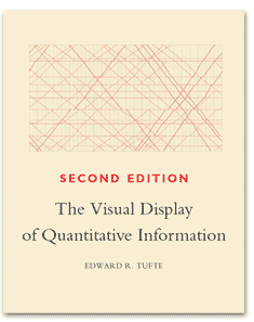
The Visual Display of Quantitative Information, by Edward Tufte, is a beautiful book. It's not just well-written, it's really beautiful, you feel like every inch of the book was planned and designed with great care. The book makes the case for better data graphics, shows you several examples of great graphics (some of them were published centuries ago), plus some bad examples and how to improve them.

After reading it, I feel much more prepared to create graphs and choose better visualizations for the different kinds of data that may end up on my lap. Also, while reading the book, I got a lot of ideas for new things to try – I don't know if I'll ever be able to actually implement them, but it's been refreshing anyway.
I've put down a few notes from the book just to whet your appetite, so here you are.
Good graphics tell a story
Data graphics are not about aesthetic sensibility of the artist who created it, nor making boring data a bit more fun. Great data graphics tell you a story about something, communicates complex stuff in a clear way, makes you wonder about the data on display, there is no need for distracting decorations.
That's also why good graphics are often about multivariate and complex data, bringing new ways to look at it, enabling you to make comparisons and reason about it.
A nice example used throughout the book is the graphic by Charles Minard showing Napoleon's disastrous attempt to conquer Russia:
Good graphics don't lie
It's all about conveying precise information, so any tricks to distract the viewer from the truth are a bad idea. It's not much different than the written words, after all.
Therefore, when constructing data graphics, make the physical representation of numbers in the paper or the screen always directly proportional to the quantities they represent. Do not bend rules in a way that may distort the data and induce erroneous comparisons. Do not use 2D graphics for 1D data. Finally, do not quote data out of context: show the full history of the measurements and take inflation into account when showing money-over-time.
Above all else show the data
Data-ink ratio is the proportion of a graphic's ink devoted to the non-redundant display of data-information. Namely, it represents the parts of a graphic that cannot be erased without loss of information.
The process of creating a great data graphic involves maximizing the data-ink ratio, reducing all the non-relevant information.The folks at DarkHorse Analytics have done a good demonstration of this in their neat Remove to Improve slideshows (read more about it on their blog).
Friendly data graphics are accessible
And this does not mean that you should "dumb down" the graphic to make it more accessible, but that you need to have the viewer in mind while constructing it.
Therefore, you will spell out the words instead of using abbreviations, annotate the graphic with helpful little messages instead of requiring elaborated legends, use colors in a way that color-deficient people can also make sense of the graphic (tip: use red-blue instead of red-green for contrast), use clear, precise and modest font types, upper-and-lower case and with serifs.
Liked it? Buy the book and read it, it's worthy it.
Thanks Paul, for the great book recommendation. =)